Logos are the visual representation of your brand. They’re a super concentrated, get-it-in-an-instant symbol for all of the thoughts and emotions conjured when people think of your company. They’re shorthand for so many things. Think of the golden arches. As a kid, they meant Happy Meals and special times. Just seeing them could make us salivate. Logos are powerful stuff. But they can’t always stay the same forever. As times change, industries change, design tastes change, and companies change with them, brands that want to stay relevant need to change too.
When your brand is undergoing a little or a lot of transformation, it’s important to take a step back and take another look at your logo. Does it still reflect your company the best it can?
Logo Evolutions: The Baby Steps Approach
If your brand needs a little change, a logo evolution can help accomplish this. A logo evolution is exactly that—a step by step transformation with slight changes over time. It can include a newer font to update the look, a rearrangement of wordmark, design and font, a slightly updated color palette, a tweak to modernize the design, or a combination of these.
There are myriad reasons why you might want to evolve your logo and not redesign it. Generally, a logo that has tremendous equity and recognition is a candidate for an evolution, not a revolution. It might just need a refresh to keep current, while retaining all of the power of the existing brand. Here are some of the top reasons to consider a logo evolution:
- Your logo has been the same for years…and years: Just like with haircuts, sometimes you need a little updating. There’s nothing wrong with your logo, per se. It’s just been the same for so long that it’s becoming a bit like wallpaper to your customers and your team. The design may be dated, the font a bit stale. As other, newer brands and logos take the stage, yours seems to fade into the background more and more. An evolution can breathe new life into it. And as an added bonus—when your team embraces this upgrade, your team culture will learn to prize continuous improvement.
- You love it too much to leave it: When your internal team is attached to your current logo but it’s feeling outdated, an evolution can update without causing an upset. People grow understandably attached to logos since they represent the brand so succinctly. If the internal team doesn’t have the appetite for a large overhaul, you can make small changes to achieve a newer look but leave the essence of the brand intact.
- The industry is changing: If your industry is becoming increasingly crowded and you need to reclaim your brand equity to stand out, a full scale change doesn’t make sense. Rather, you can capitalize on your brand’s strength. Rather than trying to reinvent yourself and getting further lost in the crowd, you can still make a splash with a newer design that stays true to the established brand.
- The audience (and their design taste) is changing: As we cycle through various generations, design aesthetics change. If you’re hoping to capture a new demographic, a few changes to the logo may help achieve that and keep them engaged.
- Your business needs a bit of a reboot: Sales are down, market share is down—but your core customer base is strong. Rather than abandoning the one who brought you to the dance, just get him a new suit. Make some tweaks to the logo and introduce it with a campaign that puts the pep back in its step. That’s the perfect time for a logo evolution.
Related: When you’re ready for a brand refresh.
Logo Evolution Examples
There are many examples of successful logo evolutions. Volvo recently evolved their logo after a series of changes over the years. The latest update recaptures the long-time look of the brand with the circle and arrow, but evolves it further to a cleaner, more simplified look in black and white, with air around the arrow to emphasize the movement and a tighter typeface for a more cohesive feel.
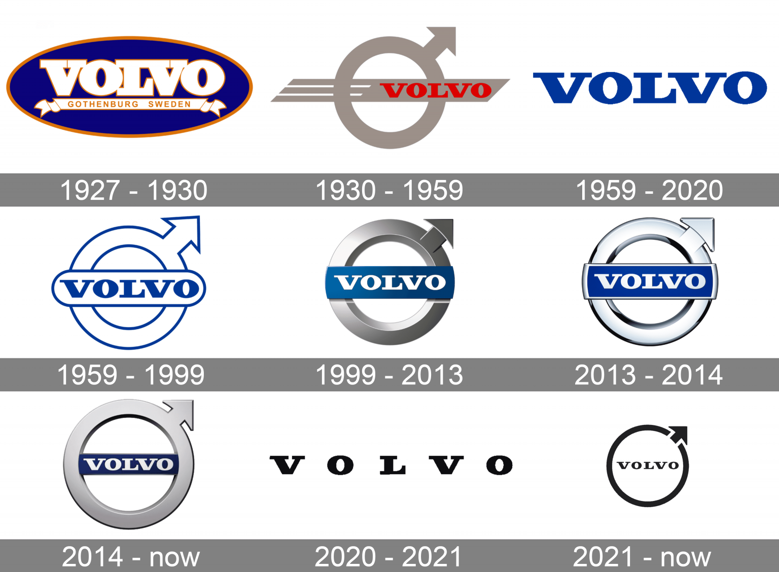
Source: 1000logos.net
Coca-Cola is another great example of an evolution. While it’s stayed true to its loopy script since 1891, the company recently returned to its roots by favoring the thinner script that was adopted in 1941. The evolution actually reclaimed that logo. Even this slight change was carefully calculated, perhaps to tap nostalgia, and certainly to keep the historic brand equity it’s built over the years. You can see the other evolutions over the years, where color and font were tweaked until they reached the iconic red signature we all know and love.
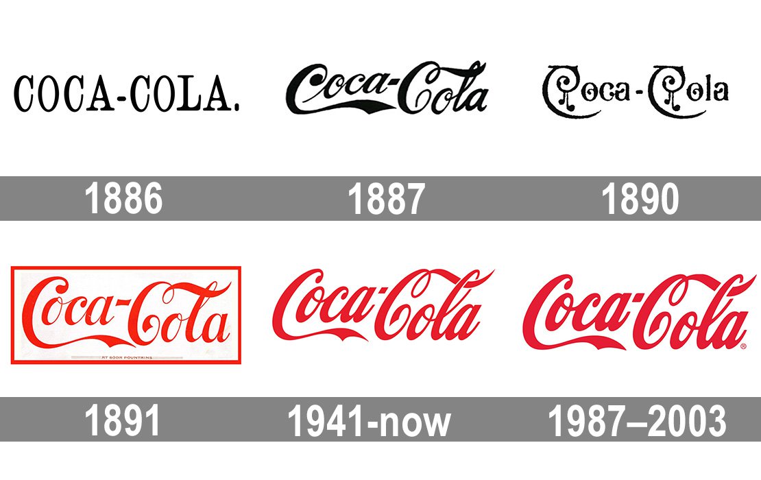
Source: 1000logos.net
Logo Redesigns: No Holding Back
Sometimes when you’re rebranding, an update calls for a more dramatic shift—a complete redesign. This process is similar to an evolution, but the changes are much more significant. For instance, a redesign might completely change the colors, design, and wordmark. There may not even be a trace of the former logo in the new one since you might change the wordmark to be unrecognizable. You might add in a new design—or completely revamp the arrangement. You may even have a new name.
Even when your brand retains equity in the original logo, it might make more sense to do a redesign to capture new momentum and communicate brand changes. There are many times when you’d want to redesign a logo and not just evolve it. Here are the top few:
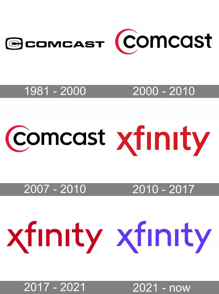
- You’ve renamed the company: When you’re introducing a new name, you’re essentially introducing a new brand personality. It’s the perfect time to redesign the logo. Comcast® to Xfinity, Facebook to Meta. These are two perfect examples of a wholesale change. If you’re moving forward with a new name, it’s confusing to keep the same look and feel of the former one. You’ve made the change for good reason. So it’s best to take advantage of that transition and create a complete redesign.
- Your company is blending with another: A merger and acquisition scenario is similar to the name change since the companies are likely rebranding together and a new design is in order. Take the Sprint-Nextel merger for example. They went with the name Sprint, but didn’t keep the Spring logo. They changed the font, and the design was completely new. This is a great example of how to redesign a logo:

- You’re doing a complete rebrand: Whether your leadership changed, the competitive landscape changed, or your services and products changed, you’ll want to leverage the transformative power of a redesign versus the incremental changes implied by a logo evolution. You want to yell, “Look at us. We’re new and improved,” and a redesign can do that.
- You’re out of alignment with the industry: Things change constantly, and if you’re not moving you may not be keeping up. If your logo no longer represents the essence of your brand and you want to remain competitive, it’s worth surveying internal and external customers to see how they feel about the brand. A redesign might be just what the spin doctor orders.
Logo Redesign Examples
Throughout the years, many companies have successfully redesigned their logos. Facebook is a noteworthy example. Since the company changed its name, the wordmark is now “Meta” versus “f.” The blue möbius strip recalls the blue of Facebook but very distantly. Everything else is different, from the abandoned circle enclosure to the new black skinny font. This logo more aptly reflects Facebook and the range of companies that it now includes.

Source: 1000logos.net
Comcast also underwent a big logo redesign when it changed its name to Xfinity in 2010. The wordmark changed, it became red, and the moon-shaped design was dropped entirely. Since then, the company has evolved the logo, edging its color slightly darker red with a thinner font, and then to the more “technologically friendly” purple color.
Source: 1000logos.net
Should You Evolve or Redesign?
There are a million ways to change your logo. When it comes to your visual identity, there is no right or wrong answer here. It all depends on the state of your specific industry, competitors and of course, your company itself. You could rely on the old “if it ain’t broke, don’t fix it” adage. If your logo is performing well and is well-received by consumers and your internal staff, then an evolution is most likely the way to go. If you’re experiencing a large shift and the logo no longer seems relevant to your brand vision, it’s time to redesign.
Logos are powerful and they can build up your business or also bring it down. Whether you evolve or redesign is up to you. When you’re making a chance, they’ll both be the right move for your business.
Still unsure what direction you should move in? Let the experts in brand strategy and design provide a consultation! Do you need an evolution or a redesign? Talk with us today!


