There’s more than meets the eye when it comes to product packaging design. Yes, it needs to protect an item effectively from the packaging to the shipping to the purchasing phases—and often beyond that. But packaging also has the potential to be so much more. Like any good gift, plated meal, or artwork, the power is in the presentation. A package that wows the recipient can sell itself on the spot. A full 72 percent of Americans Claim their buying decision (whether purchasing and not) is heavily influenced by packaging, and 67 percent are influenced by the materials!
The world of packaging design is constantly advancing, and this year is seeing some new innovations for more memorable, engaging, and forward-looking product packaging designs. Many of these are responding to our emergence from some of the darker days of the pandemic, with hopeful, calming, and earth-centered principles. Let’s take a look at the top twelve packaging design trends including visual design and structural design, that are making an impact!
Related: Top 7 Graphic Design Trends of 2022.
1. Carefree
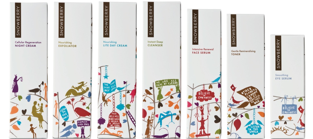
As we see the light at the end of the pandemic tunnel, we’re all breathing a sigh of relief. This trend aims to capture that light and airy carefree feeling. People want to escape a bit and enjoy life. The design aesthetic is fun and joyful, playing up emotions with whimsical imagery and bright colors. It’s artistic and beautiful, and a sign of hope for the future.
2. Calming
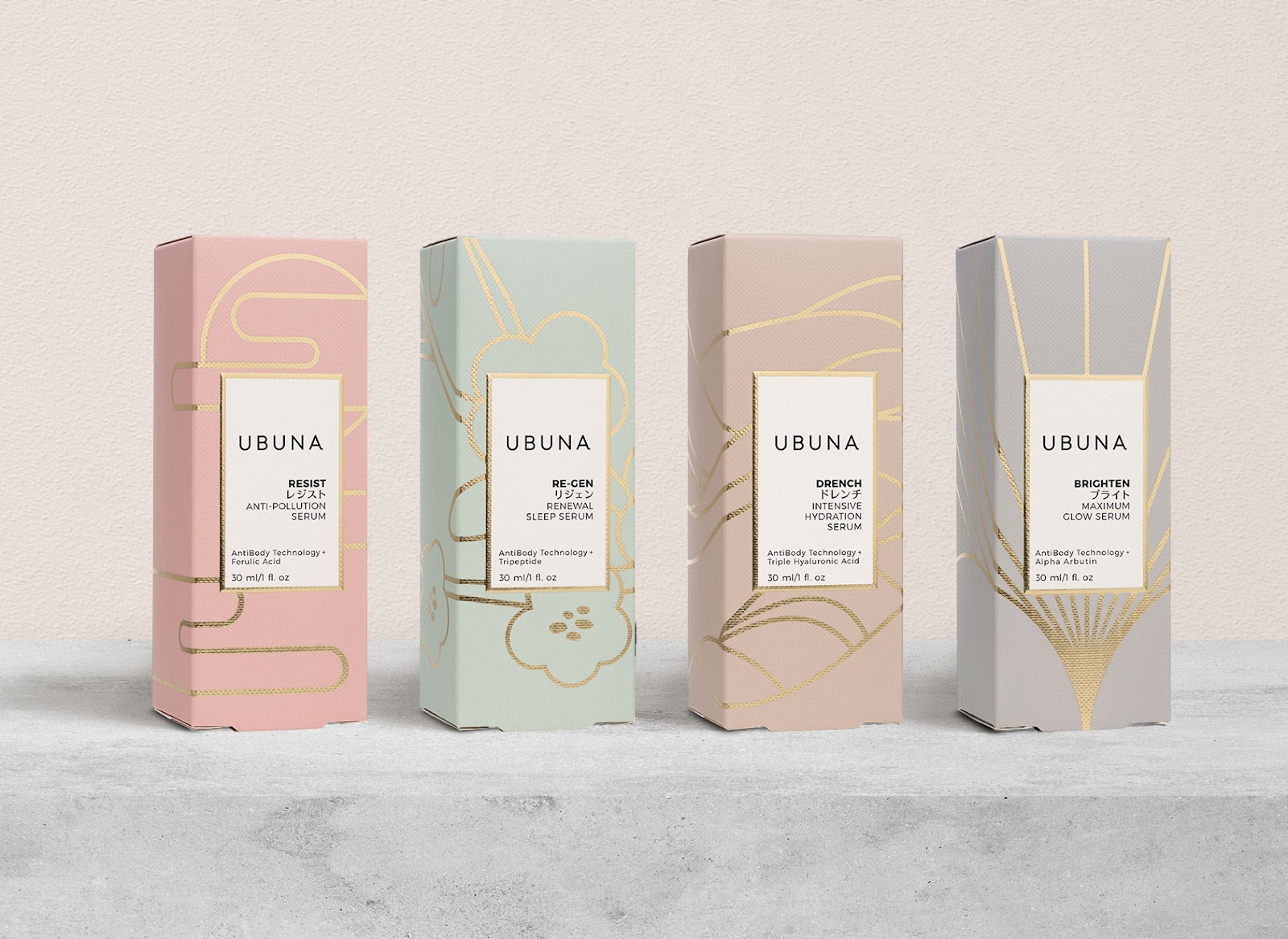
Dovetailing with the carefree trend is a calming style that’s also popular right now, again in response to the chaos we’ve been facing in the world. Featuring muted colors and a very simple design punctuated by clean and serene type, it’s a spalike idea that is bound to be here for a while.
3. Handmade
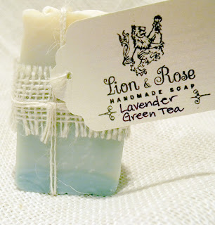
In recent years, we’ve also embraced artisan cottage industries, and the trend in packaging for handmade items goes hand in hand with this. Digital illustration and watercolor have helped fuel this “handmade” trend. Materials reflect those of yore—packagers are turning to craft paper with simple “hand stamped” lettering in black or white and very primitive natural elements, including twine, wood, and paper. Everything is matte and looks like it was hand-crafted, for a thoroughly relatable and special feel. Even the texture feels earthy and homespun.
4. Hand-drawn
For a few years now, designers have been turning to hand-drawn illustrations, sometimes in concert with other media like photography and video. Now this trend is in full force. Hand-drawn illustrations lend a warm, human feel to the design. This look quickly sets it apart from other digital designs that lack an organic and imperfect feel. Hand-drawn designs have texture and brush strokes that evoke the feeling of art. In fact, many of these packages are so pretty that recipients often keep them for long periods of time. They’re a rich way to build a narrative and touch people on a personal level.
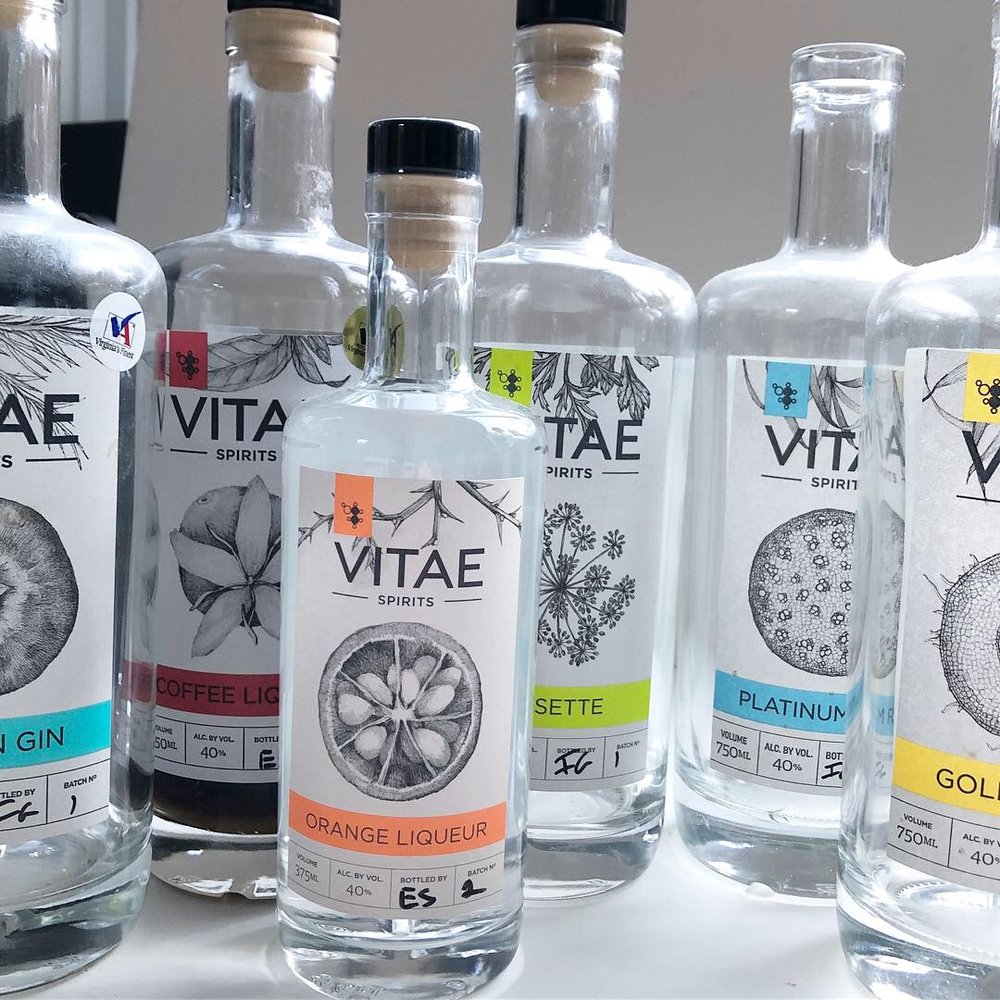 Artist: Lara Call Gastinger
5. Gradients
This trend has been building for a while too. First, we had ombre hair, and now gradients seem to be everywhere, from social media elements to websites to product packaging design. They’re a simple way to add depth and interest to a package, and they’re versatile too. Whether you select colors near each other on the color wheel or opposing, they have a satisfying vibe and can make the subject stand out. The end product is polished and professional.
6. Color Mists
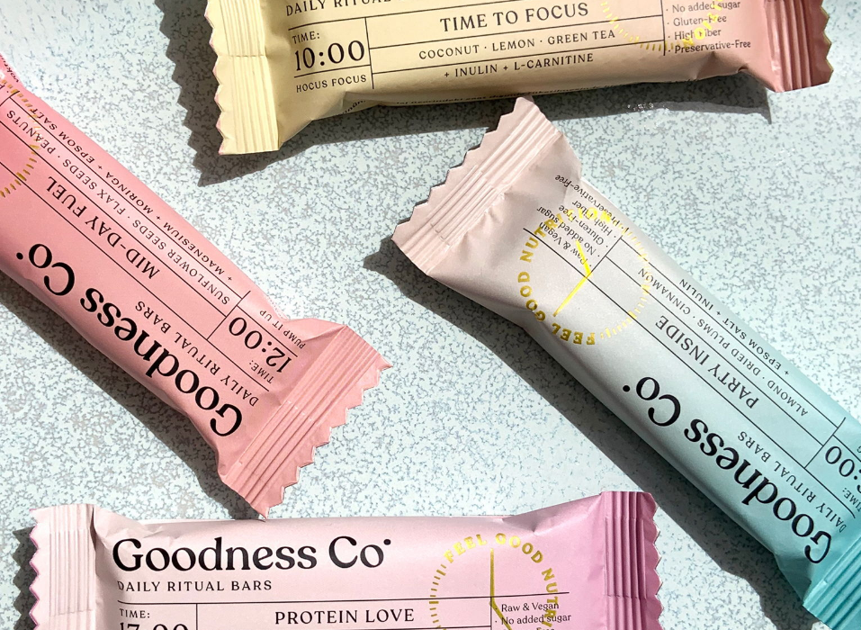
Similar to the softness of gradients, these eye-catching blocks were likely popularized by graphic designer Tessa Forrest, and now are all over Instagram. They are a fun pop of color that is simple and sophisticated, with an artsy vibe that is fresh and daring.
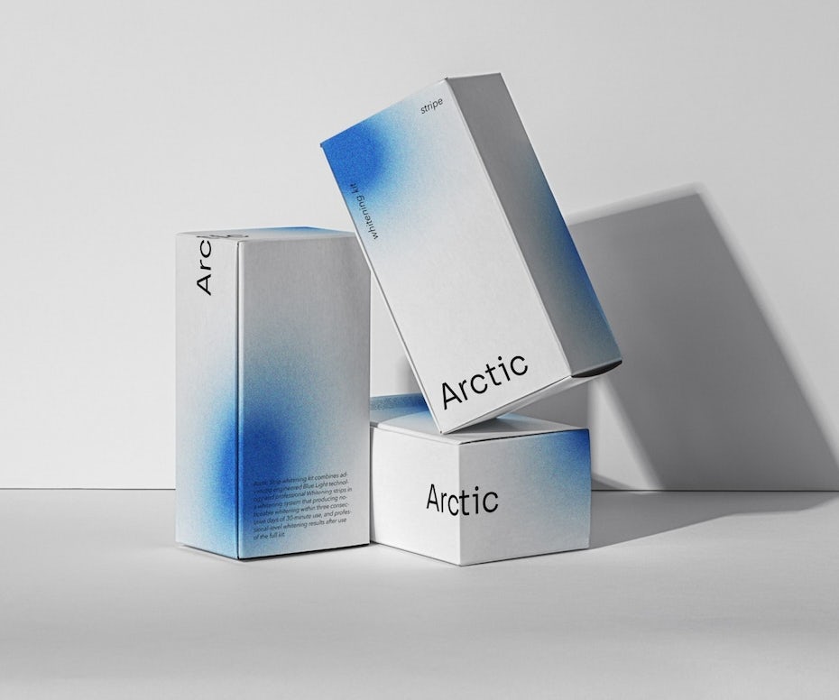 By AdamK
7. Cool Typography
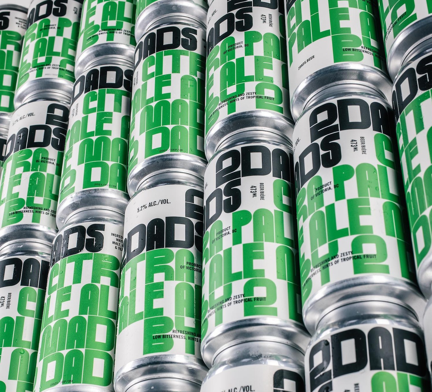
Designers are having fun playing with fonts and pushing boundaries by changing up the negative space, deploying optical illusions, using colors that purposely clash, and making words difficult to make out so people have to work harder to be rewarded. The result is an edgy and cool new approach that really stands out. These letters also tell the brand story in their shape, providing a deeper look into the brand personality.
8. Sustainability
Like the hand-made trend, this packaging feels very organic because it is. People are driving the market for more sustainable goods, and packagers are delivering. These new packages are recyclable, renewable, compostable, and sustainable. Manufacturers are swapping out plastics for glass and other reusable materials. There are corn, sugarcane, coconut husk, mushroom, and more-derived materials that really push the packaging envelope.
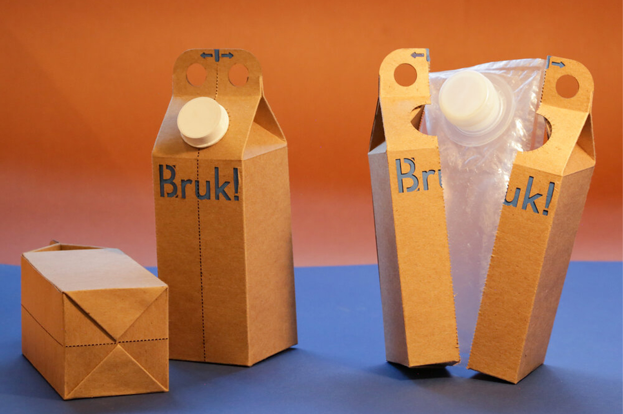
9. The Feels
Texture is important with sustainability and it’s also important as a product packaging design trend in 2022. Haptics is an additional sense that evokes emotion and is highly impactful when someone is considering a product. It communicates luxury, earthiness, high quality—or whatever brand characteristic you want to highlight.
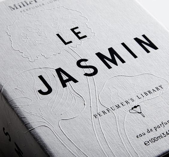 Progress Packaging Miller Harris
10. Value-Engineered
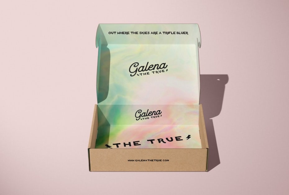
This concept takes sustainability a step further by helping to reduce waste and maximize the package. It’s like using the entire animal to create a meal. There are so many clever designs that turn packages into storage and shipping vessels, advertising vehicles, or even games. By approaching the design from a value-engineered perspective, each piece has its purpose, usually more than one. Sometimes designers stretch space by placing advertising or other communications inside the package. Known as “pack-vertising,” this is a fun surprise for customers and builds brand value.
11. Packaging That Interacts
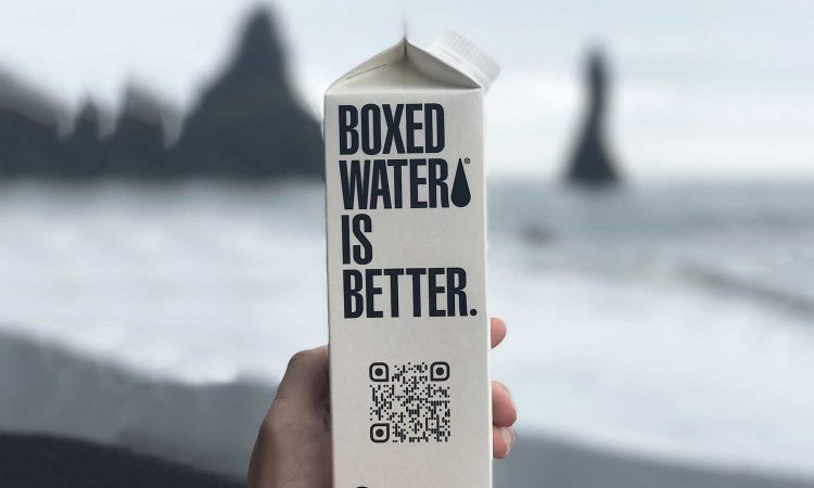
As technology evolves, it’s enhancing packaging too. Many advertisers incorporate QR codes to send people to corresponding landing pages online. Near-Field Communication (NFC) and Radio Frequency Identification (RFID) also allow packages to communicate with smart devices and start interacting with customers. This takes packaging to a whole new level of interactivity.
12. Personalization
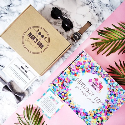
We’re getting even more personal, following the success of subscription services. Now, packagers can design images, colors, and messages specifically for customers, which increases customer’s likelihood to buy. Companies like Grove even put uplifting handwritten notes with their customer’s name on the box. You can use this tactic to test different styles. With more affordable digital printing techniques, it’s possible to try out different variables to see what works best.
Related: Packaging Design.
Packaging that Doesn’t Hold Back
Interested in trying these trends on for size? We’re here to help. We’ve been putting powerful packaging together for over 60 years, and we love the challenge of designing the best box or vessel for your product! Whether one or all of these trends appeal to you, we can help you find the design that takes your package to the next level—and delights everyone who receives it. Reach out today for a free consultation on how you can turn your packaging into a powerhouse.


