If you haven’t implemented color psychology in your brand or marketing strategy, now is the time to get on board – you’re missing out on an incredible opportunity to elevate your brand and maximize your marketing potential.
The relationship between color and psychology in branding and marketing is a salient and interconnected one, and the use of color can make visual content impact consumer perceptions and behavior.
Color Theory
Why is color such an important element when it comes to branding and marketing? It starts with engaging the consumer. Consumer engagement is critical to brand success, and being able to attract consumers is the first thing you need to do. This is where color theory comes in. So what is color theory?
Color theory is the established rules and guidelines that relate to color and its usage in visual interfaces, with an emphasis on creating appealing and impactful color schemes. Color theory allows you to strategically choose colors and palettes for your marketing materials in order to elicit a particular appeal, emotion, or mood. According to Insights in Marketing, 93% of consumers maintain that the visual appearance of a product is the biggest factor that affects their purchasing decision, while another 85% are influenced by the product’s color.
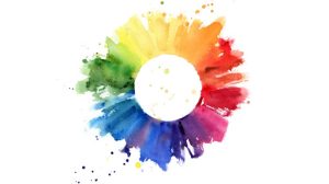
Creating compelling visuals in print branding and marketing is much easier when you study the color wheel, as it can help you to understand how color combinations work together.
Primary, Secondary, and Tertiary Colors
At the core of color theory are the basics that you probably learned as a child:
- Primary Colors: blue, red, and yellow, none of which can be created by combining colors.
- Secondary Colors: green, orange, and purple, created from mixing two primary colors.
- Tertiary Colors: magenta, vermillion, violet, teal, amber, and chartreuse, created from combining a primary color with a secondary color.
Beyond the three main color groups, hues, tints, tones, and shades make color variants possible. While single colors can be impactful in branding and marketing, color combinations can influence consumer buying decisions as well.
Related: 5 Graphic Design Trends for 2021
Color Matching
Have you ever seen a color combination that makes you question what the designer was thinking? Color matching requires some know-how and can affect consumer perception and behavior. At the end of your print project, you want your print piece to display a harmonious color scheme. Knowing that the color wheel has warm and cool colors, and what they convey, is a good place to start when color matching, but it’s also essential to master the basic color schemes, including:
- Complementary colors: two colors opposite each other on the color wheel
- Split complementary colors: a base color plus the two colors adjacent to its complementary color
- Analogous colors: three colors next to each other on the color wheel
- Triadic colors: three colors equally spaced around the color wheel
- Tetradic or double complementary colors: four colors that form two sets of complementary colors
Additive and Subtractive Colors: RGB and CMYK
In color design, you need to choose between additive and subtractive color models. Your choice will depend on whether the finished product will appear in digital or print form. The additive color model is RGB (Red, Green, Blue) and it’s typically employed in digital communication. The subtractive color model is CMYK (Cyan, Magenta, Yellow, Key (Black)), which is used in 4-color process printing or tangible print pieces.
With the RGB model, all colors begin as black and the RGB lights are added to brighten and achieve the ideal pigment, but all three colors can be mixed to create pure white. CMYK models start with all colors as white and the printer mixes the CMYK colors with ink that decreases the brightness to produce the desired color.
Related: CMYK vs RGB: When to Use Them
Colors Help Brands Communicate
The meaning behind colors is crucial to brand communication with consumers, because colors influence consumer emotion and behavior on a personal level. Many consumers attach certain traits to single colors and color combinations – positive or negative. Here’s a quick look at the meaning that some common colors convey.
Red — aggressive, power, impulsive, hunger, passion, energy, love, action, danger
- Beneficial in encouraging consumers to take action
A great example of the effective use of red is Coca-Cola’s bright red background with white text. The logo is recognizable by 94% of the world. The use of this color combination even helped to popularize Santa Claus, who’s portrayed in advertisements with a red and white suit. As a result, Coca-Cola has become synonymous with Christmas, and this has been a large part of their overall brand. The brand draws on red for impulse buys, while the white lends to the pure and refreshing appeal of the product.
Orange — joy, optimism, happiness, caution
- Ideal for positive messaging for a product or brand
The Home Depot logo, for example, is a recognizable emblem in retail thanks to the characteristic orange color displayed. It’s minimalistic, but inspires activity and speaks to the brand’s affordability.
Yellow — happiness, enthusiasm, calmness, intellect, warning
- Great for pulling attention
Snapchat’s cheerful logo, a white ghost on a Pantone yellow background, appeals to its younger target audience, reaching 75% of millennials and Gen Z. Traits such as creativity, excitement, and happiness all come across in the simple logo that catches the attention of younger users.
Green — peaceful, healthy, relaxed, positivity, growth, or ambition
- Useful in communicating brand growth or rising status
Green is a dominant part of Starbucks’ logo. It speaks to the brand’s goal of promoting a relaxed and peaceful atmosphere in its cafes, as well as the positive approach the brand takes in caring for and treating its customers.
Blue — tranquility, confidence, communication
- Used to establish trust and feelings of security
Through the use of the color blue, American Express has been able to convey its goal of promoting security, trust, integrity, and stability.
Purple — luxury, creativity, wisdom
- Often used to emphasize beauty
Purple is associated with royalty – and Cadbury’s regal purple (Pantone 2865c) gives consumers a feeling of decadence, luxury, and high quality. If the message you want to convey with your brand is one of opulence and regality, purple is the way to go.
White — safety, purity, innocence, minimalism, cleanliness, elegance
- Useful for streamlining your message, whether digital or print
Steve Jobs’ Apple logo, displayed prominently in white, evokes purity and syncs with his elegantly-designed products. It emphasizes minimalism, clean lines, and creates a modern feel.
When deciding on the best color options for your print job, consider making user experience a priority and keep brand essence in mind. Know the mood that you are going for with your color scheme and don’t forget color context and perception. If you need help, our creative team and print experts are here to help. Get in touch with Ironmark now, and see what we can do for your next batch of visual materials.


