Highlights:
- CMYK and RGB are two different color models used in design.
- CMYK is for print (cyan, magenta, yellow, black).
- RGB is for digital screens (red, green, blue).
- Using the correct model ensures accurate color reproduction in both print and digital media.
- Keep reading to learn more.
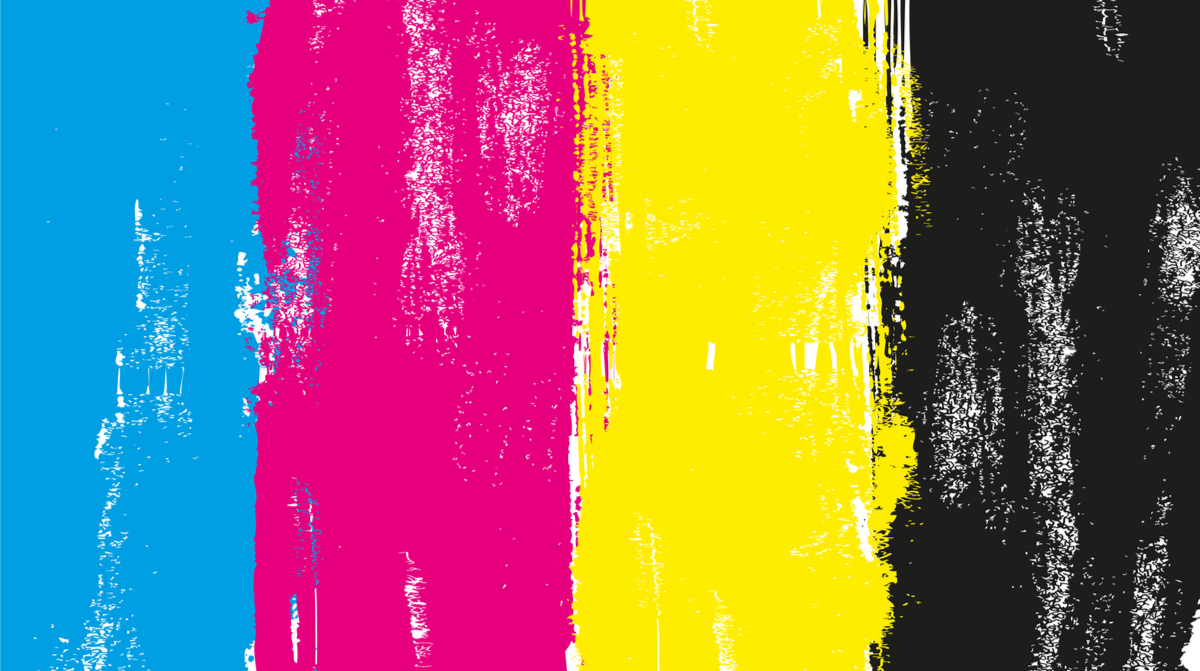
Which color model works best? In a nutshell, CMYK works best for printed materials such as flyers, brochures and signage. It stands for Cyan, Magenta, Yellow and Black, which are four inks that offset printers use as standard.
The RGB (Red, Green, Blue) color model is for sensing, representation and display of images in electronic systems (think TV screens, image scanners and digital cameras) and is based on the human perception of color.
But there are two more color models we’ll dig into: PMS and HEX. It really boils down to what your finished product is and how you will display it to customers.
Color models are a complicated topic, especially for non-designers. So, if you don’t know the first thing about color, here is the perfect primer to start learning. There are multiple color models, used for different purposes, in the design and print world. It ultimately depends on your desired final product, and the way you want it displayed to your audiences. Before we dig in too far, let’s define the different color models and how to put them to their best use.
Related: Color Theory in Branding and Marketing
PMS vs. CMYK vs. RGB vs. HEX: Which One Is Best for My Project?
When talking about color design, the most commonly used color models are PMS, CMYK, RGB and HEX. The choice between them depends on the purpose of the design – will your finished product be printed, or will it only appear in digital form?
Keep in mind that if your design will appear in both print and digital forms, you need two versions – one in CMYK or PMS and one in HEX colors. Your commercial printer may have additional file type specifications when the time to finalize your print piece comes.
Related: 4 Must-Have Design Templates Every Business Must Have
What Is CMYK?
CMYK stands for Cyan, Magenta, Yellow and Black. The “K” instead of “B” for black is a hold-over from printing press times, when it was referred to as the ”key” plate.
CMYK is used for traditional print methods – the colors are generated through a subtractive method from white light. Most commercial printers do not use white ink. When the four CMYK ink colors are combined, they make black.
In the printing process, CMYK colors are printed on top of each other using different percentages of transparent inks. The mechanism is simple: colors are obtained by printing halftone percentages of tiny dots of color that are so small they can’t be seen with the naked eye.
Learn More by Talking with Ironmark’s Creative and Print Experts

What Is RGB?
RGB stands for Red, Green and Blue. Together, these colors of light make up the entire color palette on digital screens (like TVs and digital cameras). RGB is the best choice for anything online, like your website, ad posters or banners, and logos.
RGB colors are generated through an additive method, and the three colors combined together make white. RGB is necessary because computers can render color more accurately than paper, and the color tones must be different to reflect this. Using CMYK colors for digital work can produce more muted tones, depending on the specifics of the design.

What Is PMS?
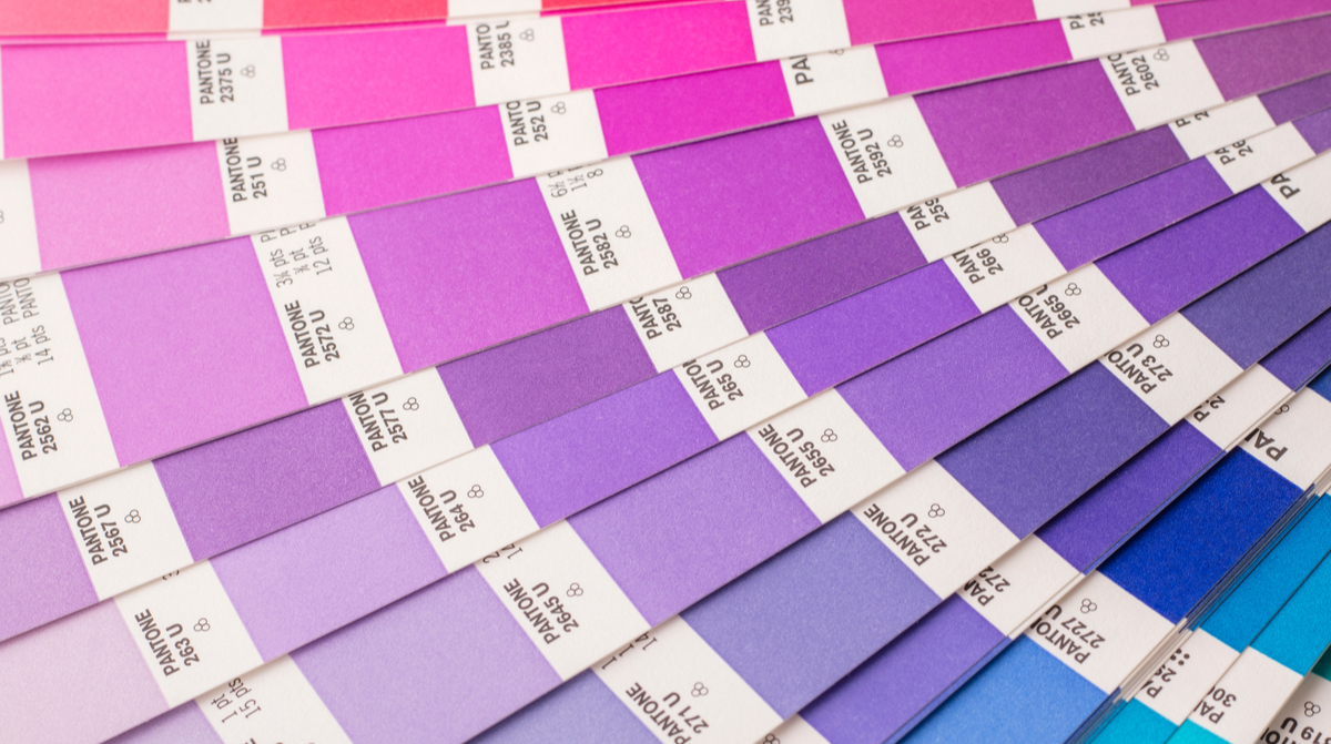
PMS, also known as the Pantone Color Matching System, refers to the standardized color matching system used by printers worldwide. It’s regarded as the standard for color printing, and the use of PMS enables different printing professionals to easily match the desired colors for a print project. The use of color codes, such as Pantone 204C, allows printers to know the specific color needed and thus replicate the print project exactly. These colors are best used for printed work, rather than online projects.
What Is HEX Code?
Those of you who work with systems like HubSpot are likely familiar with HEX color codes.
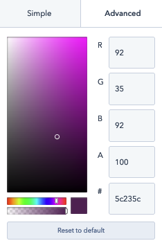
These are six symbol, alphanumeric codes that define specific colors and shades, making them easier to replicate. HEX codes are excellent for use in digital media, and allow you to specify incredibly precise colors. This helps you to stay consistent on colors for your brand identity, as well as specific materials that are seen by your online customers (such as marketing emails and website pages). Remember that these colors are intended for digital display, not printed works.
Related: Graphic Design Terms You Need to Know
Common Mistakes
One of the biggest (and most common) mistakes made during the design process is creating for print projects in a digital space without taking the color mode into consideration.
Related: Pre-Press Checklist for Graphic Designers
Forgetting to account for the print color models in the editing program will lead to printing your work on paper using digital settings. The colors will be different from what you intended, and the results won’t be great.
You may also need to color correct your design manually before sending it to a commercial printing company. Adjusting the CMYK settings and touching the hue or saturation values are the last thing you want to do when you have a tight deadline and a client waiting for your work.
If you’re a small business owner and you need assistance printing flyers, banners or other branded materials, our professional printing team can help with guidance and tips that will save you time and money. And our top-notch creative team can help you design your projects and get them produced in just the right colors! Based on our 60 years of experience in print, as well as marketing, we know the color mode to ensure your marketing materials are impactful and get the best results. Contact us today to get your next project off the ground.


