A fresh new year is here, with all of the possibilities and opportunities that come with turning the page on 2022. It’s the perfect time to formulate your plans for new sales goals, new messaging goals, and more.
A new year means new brochure ideas are in order, too. Whether you’ve been printing the same old brochure for months (or years!), or haven’t put one out in forever, now’s the time to take a good look at how you want to represent your brand. As you know, brochures are like websites: they present important information about your company at a glance. In many ways. they’re better than websites—their visual attractiveness, tactile feel, “in-the-moment” quality, and affordability make them highly effective, especially in today’s screen-weary and cluttered climate.
THE POWER OF PRINT
When you use brochures as part of a comprehensive, print-based campaign (or in conjunction with digital media), you can surround your customer with different touch points at different times—and really bring your message to life.
RELATED: PRINT ADVERTISING – A MULTIFACETED APPROACH
But don’t just take our word for it. Many studies point to brochures as a “secret weapon” in the marketing arsenal, as more people crave real experiences with a brand, not just images seen through a screen. Bentley University tells us that 79% of tourists like to pick up brochures, 85% of people who read brochures actually learn about new businesses, and 61% of people buy products once they see them in brochures. Brochures work.
A FRESH LOOK FOR A FRESH START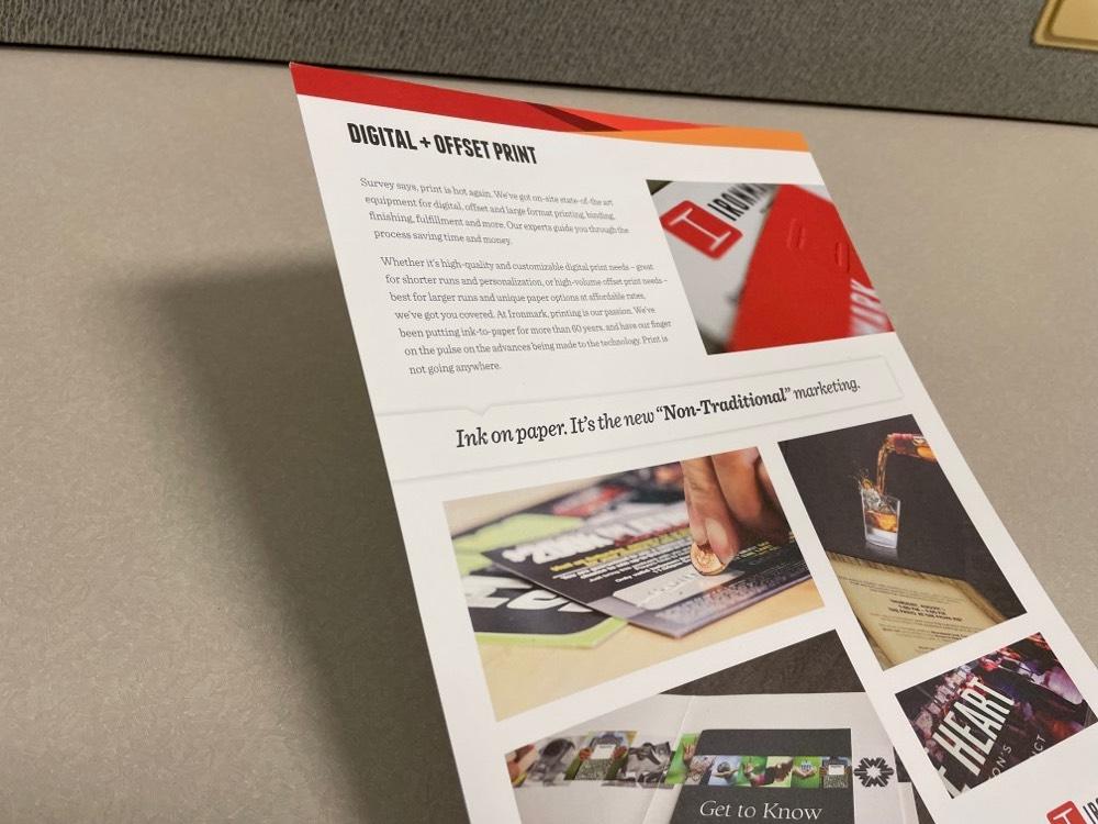
The best news is that brochures are also an easy and affordable way to update your brand image. Just like any other form of communication, you need to catch your prospect’s attention right away—and compelling design is the way to do it. So how do you create a brochure that stands out from the rest (aside from placing it in the front rack)? When you freshen up your message by leveraging the design elements listed below, you can make your brochure a sure-fire hit.
RELATED: HITTING YOUR BROCHURE DESIGN OUT OF THE PARK
1. BRAND IT
Your brochure is part of a multi-point communications plan, so make sure your brand shines through. Keep it consistent, silly! This means sticking to a design and voice that will leap off your website, echo the ethos of your people, emulate your retail space, and land right on the brochure pages.
On the design side, make sure that the colors, font styles, and layouts adhere to your brand standards. Be sure that they match the look and feel of your other materials. Use a maximum of three fonts to keep it clean, and ensure that your photography is high-res and consistent with your vibe.
On the writing side, make sure that your tone matches the tone of your other materials. Whether it’s professional-and-warm, quirky-and-fun or technical-but-accessible, it needs to speak to your customers in their favorite language. Keep the copy concise and compelling. The more distilled the message, the easier it will be for the reader to absorb and act on. Brevity is the soul of wit—and good marketing.
Related: How to Audit Marketing Collateral for 2023
2. LAY IT OUT
You know your customer best. How do they like to receive their information? Would they like a lot of pictures and graphics breaking up the groupings of text? This is always a smart strategy, since people are drawn to pictures, and they are reading less and less these days.
3. CATER TO THE CUSTOMER
While many of us don’t take the time to thoroughly read the copy (see above), your chances of reaching your customer are greater if you break your text up and use enticing headers to make it skimmable. A ratio of about half text and half graphics is usually very attractive to readers. To communicate more information, you can send readers to your website with a link or QR code.
4. VARY YOUR GRAPHICS
Make your brochure visually arresting by using blocks of color to call out text. Use charts if applicable. A variety of elements unified by the same color scheme will make it more professional and credible. Remember to keep the design clean and use a balance that tells the story but doesn’t muddy it.
5. FOLD IT UP
Believe it or not, there are at least fifteen ways to fold a brochure (and more if you turn it into origami). The folds are determined by the content, so the messaging and layout (along with your budget) will decide if you’ll use a gatefold, Z fold, tri-fold or roll fold. People gravitate toward tri-fold because it is familiar and provides plenty of room for text and graphics. However, a longer format message might be better served up in an eight-panel roll. You’ll also need to think about how you’ll display these brochures so that they fit in the rack. And if you’re mailing them directly to prospects, a brochure that folds to a standard mailing size is a must to control mailing costs.
RELATED: How Much Do Brochures Cost?
6. FINISH IT CORRECTLY
The feel of a brochure speaks as loudly as what it’s saying. Choose your cardstock carefully and decide if you want a glossy, matte or other special finish. Consider that thicker stock with glossy or matte finishes is perceived to be “higher end.” On top of that, adding coatings will reduce scratches and smudging, making for longer-lasting, quality material.
7. MAKE YOUR CTA THE STAR
Ultimately, the brochure’s goal is to build your brand and generate leads. So don’t forget to place your phone number and contact information in an easily accessible spot. Next, highlight your call-to-action (CTA) with a crystal clear motivator: “Call us for a free proposal,” “Find retailers on our site,” “Get a discount when you buy two or more,” etc. These are all ways to encourage action right away. And they work!
RELATED: 4 Brochure Binding Types
8. DO SOMETHING DIFFERENT
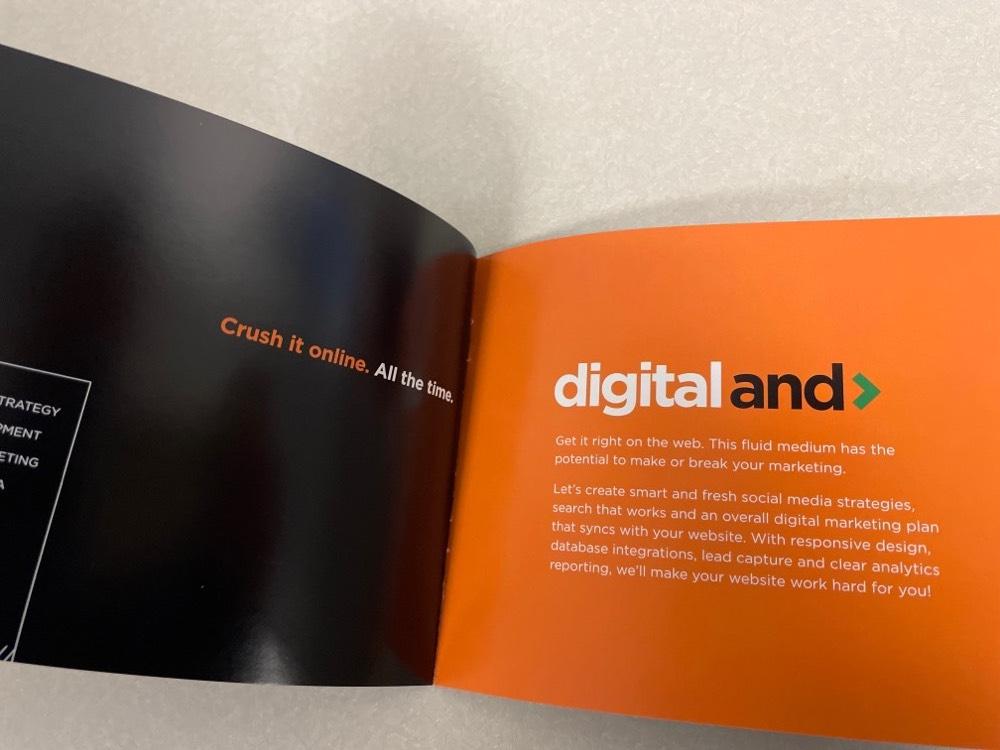
Like all good advertising, freshness and innovation turn heads and spike sales charts. If you can create a piece that cohesively tells your story and does it in a new way, all the better. Our brains look for the novel, and we remember things that stand out and feel different. When you deliver a unique customer experience, you’ll be more likely to call your customer to action too.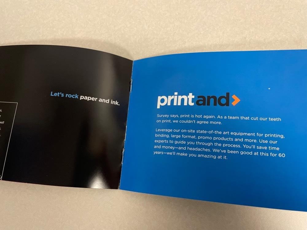
With these simple steps, you can create a brochure that brings in the new year by bringing in some new business. Not sure where to start? Let the print experts here at Ironmark help you harness the new for 2023!


