You’ve got to admit that going to the mailbox can be a bit exciting. You never know what is going to arrive. While our email inboxes pile up with a hundred or more messages each day, there are typically just a few pieces tucked into your mailbox. That’s why direct mail is so effective. We’re not used to getting as much mail, and there is power in the sensory satisfaction of receiving postcards, brochures, catalogs, letters, and more. Gallup tells us that 41% of adults look forward to receiving mail each day (not just the kids!).
Why Direct Mail Works
Direct mail is a cost-effective way to get your target audience’s attention, provide a long-lasting message, and act as a call-to-action that can be easily tracked. Many studies are proclaiming its merits. For instance, when you compare the average direct mail response rate of 4.4% to the average email response rate of 0.12%, you’ll find there’s a 3,500% increase in responses with direct mail. These mailings also have a longer shelf-life since they’re kept in the household for an average of 17 to 20 days. Additionally, the U.S. Postal Service found that direct mail recipients bought 28% more items and spent 28% more money than people who didn’t receive that piece of direct mail. There’s no doubt that direct mail works. And when it’s designed to stand out, it works even better.
Related: 14 Direct Mail Ideas Your Boss Will Love.
How to Make Direct Mail Designs That Break Out of the Mailbox
There are many ways to create eye-popping, innovative direct mail pieces that help build your relationship with future and current customers and serve as another important touchpoint in your marketing campaign. Here are some of our favorite strategies to ensure that your direct mail design gets the attention and provides the leads it deserves:
- Play with Size, Color, Design, and Material: Any deviation from the standard size envelope, postcard, or catalog stands out. Whether you go bigger or smaller, your recipient will notice. The same is true for colors. You can use bold, eye-catching colors to entice people to open or read the piece. A compelling design will also draw them in. Additionally, the material itself makes a statement. If you use something more rigid, it will fall out of a stack of mail and command attention. If the texture is different, that will stop them in their tracks as well.
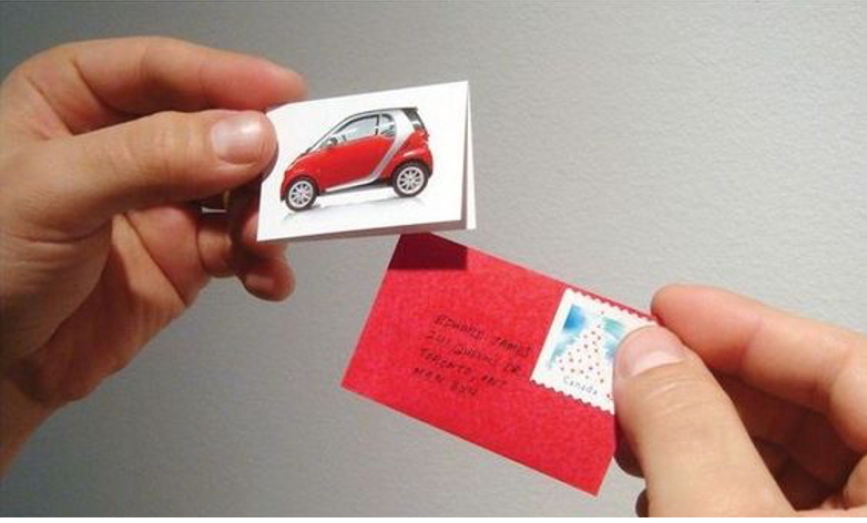
This Smart car direct mail example was too irresistible to not open—and right on message for its tiny selling point.
- Personalize: It’s amazing how addressing a recipient by their name or otherwise personalizing a direct mail piece can move them to action. A study by David Broudy and Frank Romano found that adding a name increased response rates in a mail piece by 44%, and adding a name, full color, and database information about the customer made that jump to 500%! This attention to detail answers the what’s-in-it-for-me (WIIFM ) question directly and then offers a solution. When you couple a direct mail postcard or letter with a handwritten font and add a real stamp, it feels even more personal. With variable data printing (VDP), this type of personalization is affordable and pays excellent dividends.
- Get Your Recipient Involved: People love to engage with tangible and digital objects. When you create interactive direct mail designs and offer both entertainment value and possibly even a discount or some other type of value, they’ll want to participate—whether it’s a scratch off, a mailer that you take apart and build, or a link to a digital game. Make it intriguing and you will make them respond!
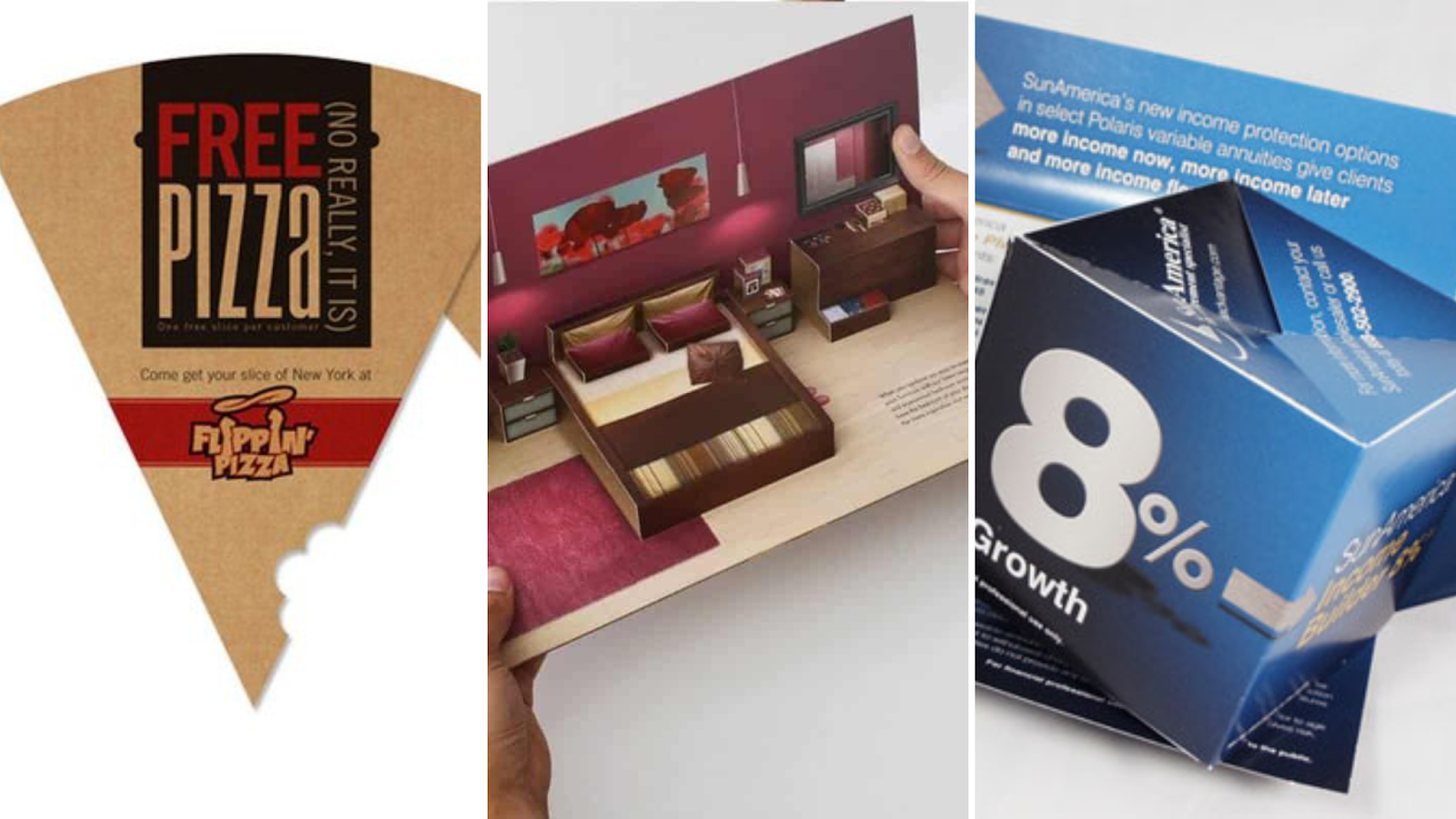
- Provide Value: Consumers appreciate a marketer who has taken the time and invested the money to send a package with value. Make sure that you’re sending something your target audience would want to receive. Whether it’s a gift card, a clever object that aligns with your brand, a coupon or a free sample, it will be saved and your message will live on. Additionally, you’ll reap the goodwill generated by promotional items. 80% of consumers react immediately to promotional and marketing products, even if they have never heard of the brand. When you give a little, you get a lot.
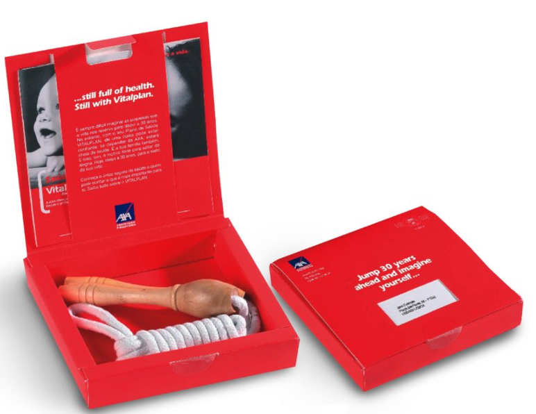
AXA hoped to attract potential health insurance customers with this jump rope, which emphasized the importance of good health and served as an attractive and practical workout tool.
- Have Fun and Get Creative: There are a million ways to have fun and get creative with your brand. Make the direct mail design memorable by bringing the message to life. Whether you’re pairing a giveaway with the direct mail piece or illustrating your point directly like the example below does, people are drawn to fun and interesting designs.
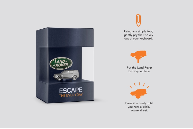
Land Rover gave prospects a Land Rover key that replaces the escape key on their computer. The key became a constant reminder of Land Rover’s “Escape the Everyday” messaging. It was also a great conversation piece.
Related: 8 Campaign-Crushing Direct Mail Blunders to Avoid.
Make Your Direct Mail Deliver
There are as many ways to design direct mail pieces as there are campaigns to promote. We’ve been helping our clients create eye-popping, needle-moving direct mail success for decades. From design to shipment to digital marketing follow-up efforts, we have the direct mail know-how to help you create a campaign that delivers even more than your expectations. Reach out today to see how your direct mail campaigns can increase awareness, drive leads, and break out of the mailbox!


