Looking to redesign a logo? Is it time to update the look and feel of your website? Working on refreshing your entire brand? In both the print and digital arenas there are some exciting graphic design trends out there right now, and we’ve pulled together the top ones to provide you with some inspiration.
Why Look at Graphic Design Trends?
As designers, it’s important to know what is appealing to the masses as creative pieces are put together. The trends now are relative to the state of the world and of society. According to Adobe’s 2022 Creative Trends report, people are looking for art and ads that make them feel carefree and joyful in a world where the pandemic has taken its toll, and people are tired of the mundane and familiar.
Whether they’re reaching back into the past or surging ahead to the future, there are bound to be some that speak to your mission and carry your brand forward. Let’s have a look:
Related: 11 Graphic Design Terms You Need to Know.
90s Nostalgia
Every decade reminisces about a decade or two before it, when things seemed simpler, we were all younger, and the world was somehow easier to manage. With this graphic design trend, we’re going back to the 90s—capturing the childhoods of many influencers in the marketplace with gooey slime, bright color blocks and the newly introduced (at the time) Comic Sans font. Designers are also drawing on simple emojis and early edition internet frames, Memphis design patterns, minimalism, and even the grunge style spawned by popular music. As we grapple with the very real challenges of lingering supply chain issues, pandemic resurgences, inflation challenges, and more, people are comforted by a decade that was largely unconnected, before the iPhone came on the scene, and when the biggest digital concern was the completely anticlimactic (as it turned out), stroke of midnight in 1999, when we headed into Y2K. Have fun with these 90s remixes!
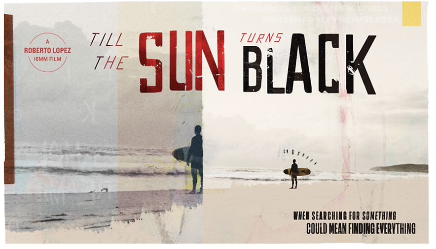
Grunge example: Never Go Hungry
Flat Vector Artwork
Another interesting blast from the past is the flat vector imagery dictated by digital design standards. Designers have brought it back through the lens of Ukiyo-e art, which is an ancient artistic style from Japan’s Edo Period that creates printed artwork with hand-carved woodblocks (and sometimes through painting). The Great Wave off Kanagawa epitomizes this look with distinctive outlining, clean open space, 2D designs, limited perspective, and flat colors; this aligns perfectly with the vibe of the vector designers. Both groups also focus on human poses and expressions to make this “flat” artwork pop.
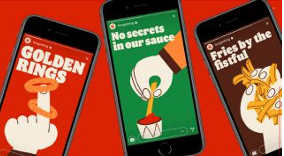
Burger King Corporation
Lettering That Goes Beyond Lettering
The further globalization of the planet today means that we are all merging into one culture in many ways. To that end, this graphic design trend is transcending specific languages to create symbols that are more universal. This lettering may seem unintelligible to us, but it’s attempting to connect people across different languages in a manner beyond language itself. And it’s an art form, with limitless possibilities. For instance, designers are creating cool new shapes, Rorschach-looking blobs, and even letter styles with varying fonts.
Some, like this new KIA logo, seem to be an optical illusion that changes when you look at the white space. Is the symbol “KIA” or is it two mountains moving together? “The rhythmical, unbroken line of the logo conveys Kia’s commitment to bringing moments of inspiration, while its symmetry demonstrates confidence,” is how the company’s press release describes it.
No matter how you use this graphic design trend, it’s important to understand your audience here. If they will be frustrated or confused by the ambiguity, it’s best to skip it. But if your brand aligns with some of these more freeform values, then it might be an interesting route to pursue. Either way, you’ll get a reaction!
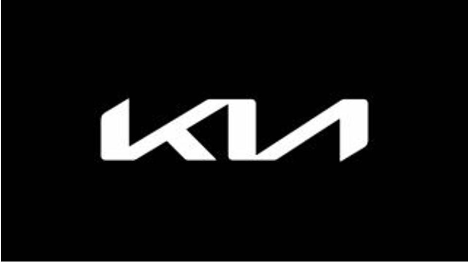
KIA Logo
Inclusive and Diverse Imagery
As the world becomes ever smaller, the values of inclusivity and the celebration of diversity becomes ever more important. Whether its race, ability, age, gender, orientation, or any number of factors, this graphic design trend seeks to include and recognize all. This is likely a response to the recent climate that has supported acts of hate and various forms of marginalization based on these differences. Marketers are seeking to reimagine and strengthen their values of inclusivity and diversity, and want to show this in their imagery too.
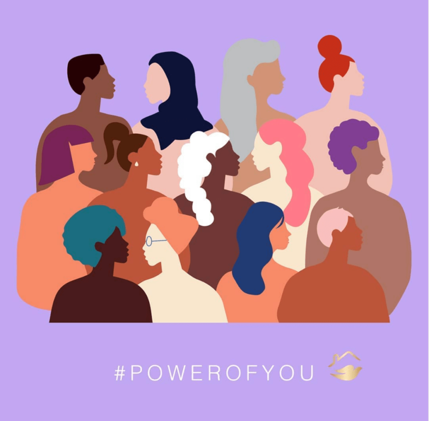
Source: Dove
Geometric Shapes
A classic design trend, geometric shapes are big again. Simple and clean, they pop in a sea of images. They are instantly recognizable too. In fact, studies have shown that these shapes evoke different meanings
- Circular Shapes: Ovals, circles, and ellipses convey unity, warmth, caring, love, softness, fun, community, kindness, friendship, freshness, stability, and feminine attributes.
- Geometric Shapes: Squares, triangles, and rectangles mean efficiency, strength, innovation, intelligence, power, practicality, professionalism, durability, and masculinity; pair them with vibrant colors to balance these and help them resonate with your audience.
- Vertical Lines: Reflect aggression, masculinity, strength, and progress.
- Horizontal Lines: Show calm, tranquility, community, and speed.
Easy to integrate into a logo, geometric shapes also lend themselves well to digital formats when animated.
Animation and Motion Graphics
Animation continues to trend. As technology gets more sophisticated, graphic designers are having fun integrating animation, and one of its subsets, motion graphics, into their designs. By nature, these small videos evoke an emotional response and can be very engaging. They’re a compact way to tell a brand story, so they work well on websites and in social media as well.
Eco-aesthetic | New Naturalism
Another new and oddly very familiar trend is the eco-aesthetic approach. Loud designs have been very prominent in recent years so these calm natural designs are standing out in the crowd. Eco-aesthetic began as a beacon of clean-living and minimalism then New Naturalism added a few more tones and sometimes a pop of color. Even though the majority of the color board is muted, many graphic artists have started to add dynamic tones. Some are even fusing neons with this earthy theme, adding new depths to their designs. They really know how to push the status quo and start a new trend. And we are here for it!

Related: Which Comes First: Design or Copy?
These graphic design trends are all very versatile. You can even combine several to help you create your one-of-a-kind look. And if you need help, you can rely on our team of graphic designers, who are experts in the eye-catching art of visual persuasion. For over 60 years, we’ve helped marketers make their mark with graphic designs that turn heads and move minds. Reach out today to see how we can help you create a logo, website, or entire brand that captures your essence, no matter what is trending these days.

